Understanding Media Saturation in Marketing Mix Models#
One of the most important concepts in Marketing Mix Modeling (MMM) is media saturation - the phenomenon where the incremental impact of advertising spend diminishes as spending increases. Understanding saturation is crucial for making optimal budget allocation decisions.
This tutorial explores two complementary ways to visualize and understand media saturation after fitting an MMM.
Direct/Marginal Contribution (
saturation_scatterplot) - Shows the relationship between spend and contribution at each time point.Total Contribution over Spend Share (
mmm.plot.channel_contribution_grid) - Shows how total contribution changes as you scale overall spend
Warning
These two visualizations answer different questions and are often confused. This tutorial clarifies the distinction and provides guidance on when to use each.
Setup and Data Preparation#
import arviz as az
import arviz_plots as azp
import matplotlib.pyplot as plt
import numpy as np
import pandas as pd
import preliz as pz
import seaborn as sns
import xarray as xr
from pymc_extras.prior import Prior
from xarray import DataArray

from pymc_marketing.mmm import GeometricAdstock, LogisticSaturation
from pymc_marketing.mmm.mmm import MMM
from pymc_marketing.paths import data_dir

az.style.use("arviz-vibrant")
plt.rcParams["figure.figsize"] = [12, 7]
plt.rcParams["figure.dpi"] = 100

%load_ext autoreload
%autoreload 2
%config InlineBackend.figure_format = "retina"
seed: int = sum(map(ord, "mmm"))
rng: np.random.Generator = np.random.default_rng(seed=seed)
Understanding the Saturation Curve#
Before diving into the visualizations, let’s understand what a saturation curve represents. In this notebook we consider the logistic saturation function:
Where:
\(x\) is the (adstocked) media spend
\(\beta\) is the saturation ceiling - the maximum contribution a channel can achieve
\(\lambda\) is the efficiency parameter - how quickly the curve approaches saturation
PyMC-Marketing provides the LogisticSaturation class to work with this transformation. This class allows us to:
Define custom priors for the parameters
Sample from the prior distributions
Visualize the saturation curves
Let’s explore how to use this class and understand how the parameters affect the saturation curve.
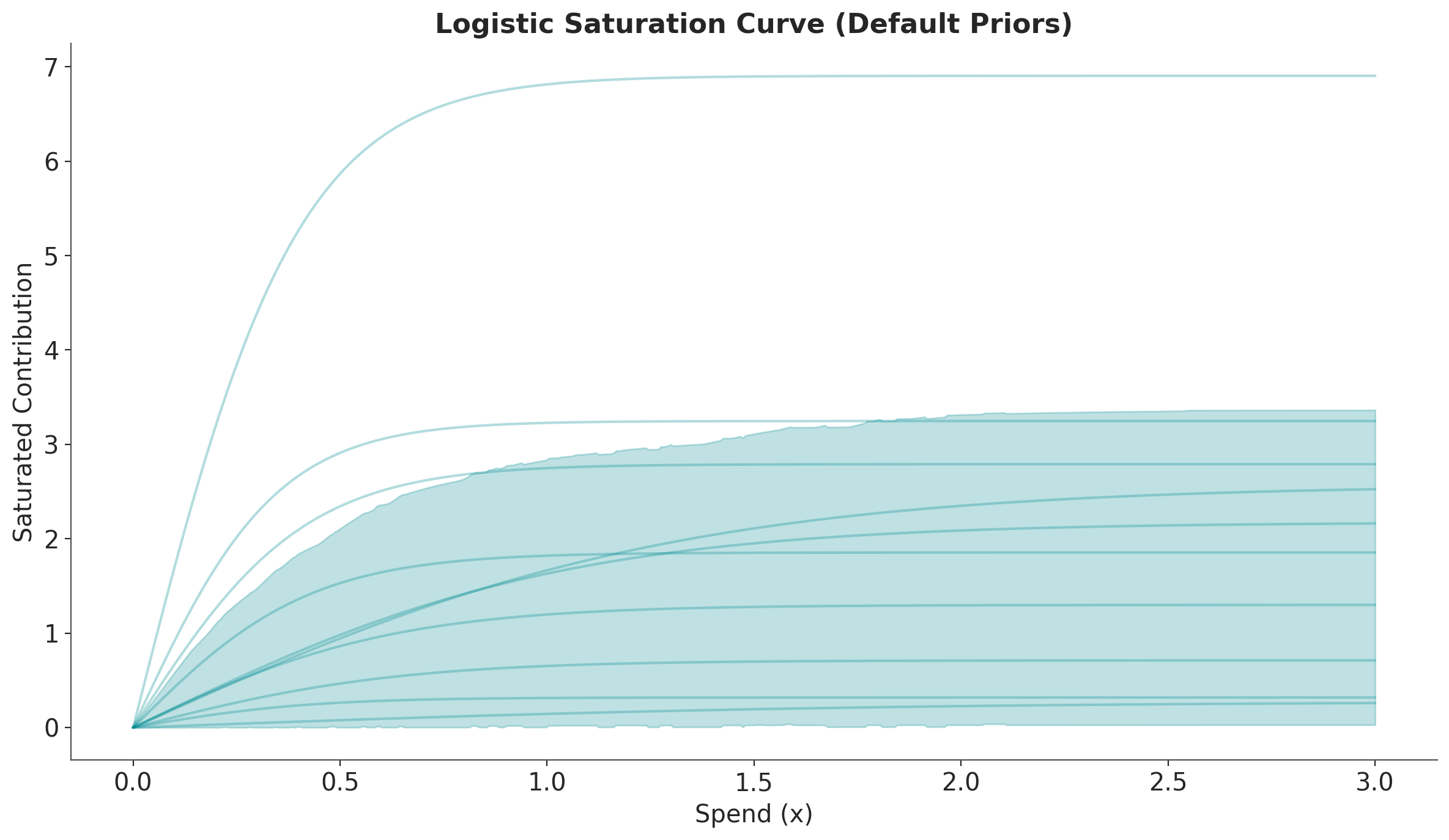
# Create a LogisticSaturation instance with default priors
saturation = LogisticSaturation()

# View the default priors for the saturation parameters
saturation.default_priors
{'lam': Prior("Gamma", alpha=3, beta=1), 'beta': Prior("HalfNormal", sigma=2)}
Note
PyMC-Marketing provides many other saturation functions like HillSaturation and MichaelisMentenSaturation.
Before doing any sampling, let’s get an intuition of how the parameters affect the saturation curve.
/var/folders/v2/k_5glrgn4mbbh_g0l7zd21b00000gn/T/ipykernel_61851/149739214.py:32: UserWarning: The figure layout has changed to tight
  plt.tight_layout()
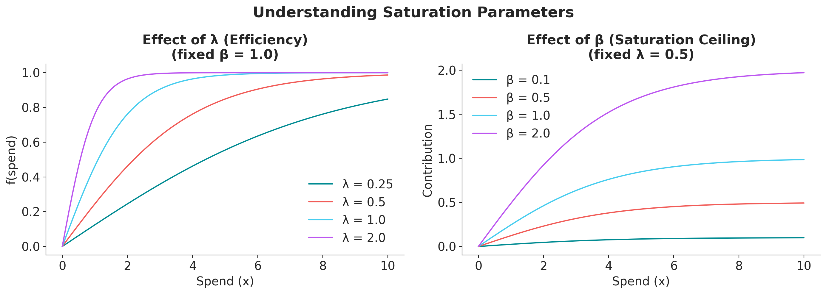
Key observations:
Higher \(\beta\) → Higher maximum contribution (the curve’s ceiling)
Higher \(\lambda\) → Faster saturation (the curve rises more steeply but plateaus sooner)
Next, we show how to sample from the prior distributions and visualize the saturation curves.
# Sample from the prior distributions
prior = saturation.sample_prior(random_seed=rng)

# Sample the saturation curve across a range of spend values
curve = saturation.sample_curve(prior, num_points=500, max_value=3)

# Plot the saturation curve with uncertainty (HDI and samples)
fig, axes = saturation.plot_curve(curve, random_seed=rng)
axes[0].set(
    xlabel="Spend (x)",
    ylabel="Saturated Contribution",
    title="Logistic Saturation Curve (Default Priors)",
)
plt.tight_layout()
Sampling: [saturation_beta, saturation_lam]
Sampling: []
/var/folders/v2/k_5glrgn4mbbh_g0l7zd21b00000gn/T/ipykernel_61851/1957016988.py:14: UserWarning: The figure layout has changed to tight
  plt.tight_layout()
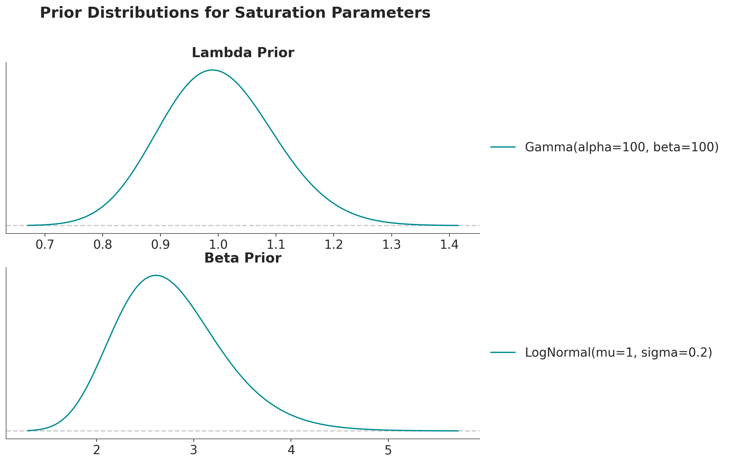
Let’s do the same thing with more tight priors.
fig, ax = plt.subplots(
    nrows=2,
    ncols=1,
    figsize=(10, 8),
    sharex=False,
    sharey=False,
    layout="constrained",
)

pz.Gamma(alpha=100, beta=100).plot_pdf(ax=ax[0])
ax[0].set(title="Lambda Prior")

pz.LogNormal(mu=1, sigma=0.2).plot_pdf(ax=ax[1])
ax[1].set(title="Beta Prior")

fig.suptitle(
    "Prior Distributions for Saturation Parameters", fontsize=18, fontweight="bold"
);
# Create a LogisticSaturation instance with default priors
saturation = LogisticSaturation(
    {
        "lam": Prior("Gamma", alpha=100, beta=100),
        "beta": Prior("LogNormal", mu=1, sigma=0.2),
    }
)

# Sample from the prior distributions
prior = saturation.sample_prior(random_seed=rng)

# Sample the saturation curve across a range of spend values
curve = saturation.sample_curve(prior, num_points=500, max_value=3)

# Plot the saturation curve with uncertainty (HDI and samples)
fig, axes = saturation.plot_curve(curve, random_seed=rng)
axes[0].set(
    xlabel="Spend (x)",
    ylabel="Saturated Contribution",
    title="Logistic Saturation Curve (Custom Priors)",
);
Sampling: [saturation_beta, saturation_lam]
Sampling: []
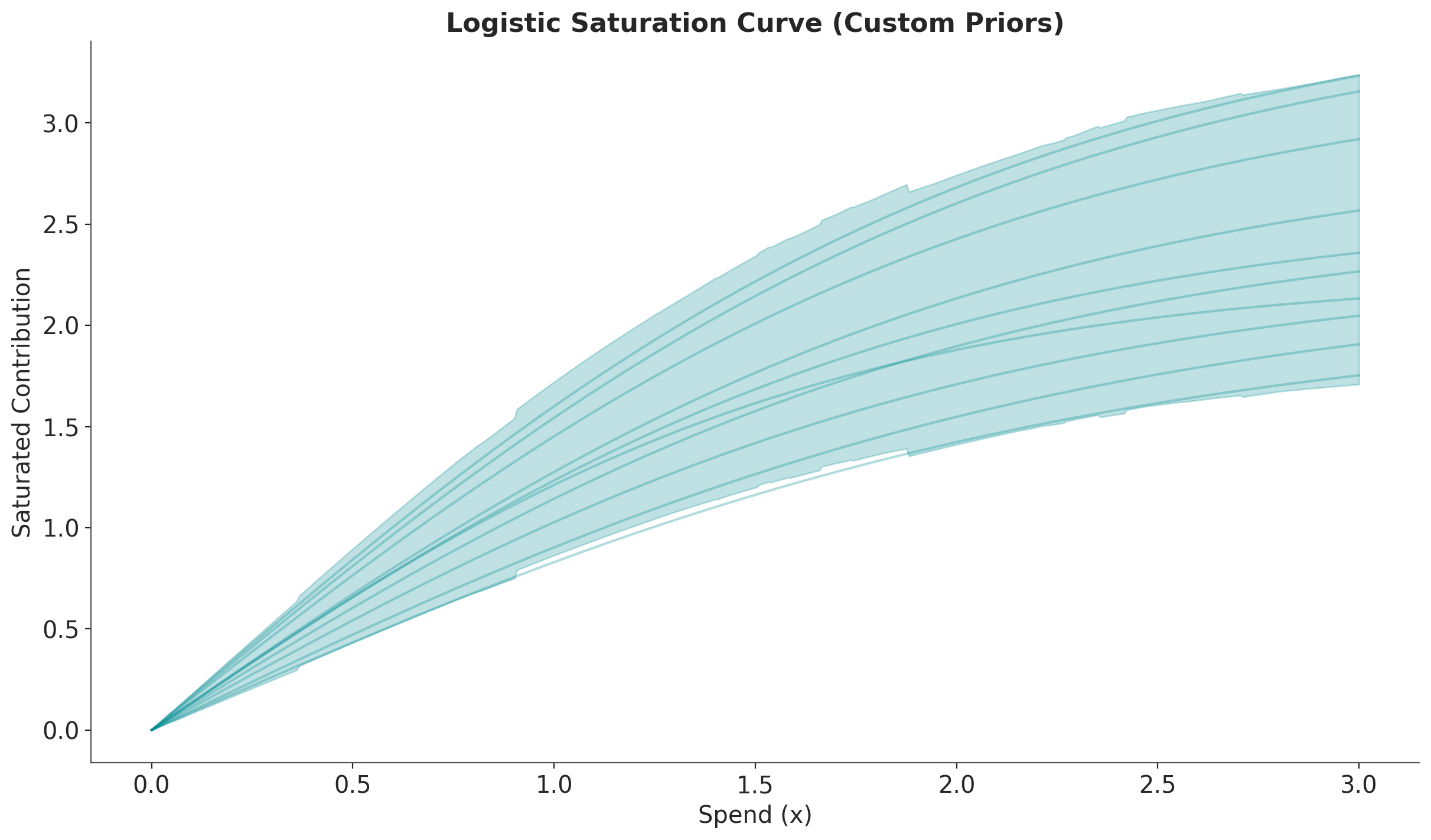
We clearly see the samples are more concentrated around the mean.
We now see how these saturation curves are used in an MMM and how to extract business insights from them.
Read Data#
We use the same data as in the MMM Multidimensional Example Notebook tutorial.
data_path = data_dir / "mmm_multidimensional_example.csv"

data_df = pd.read_csv(data_path, parse_dates=["date"])
data_df.head(10)
| date | geo | x1 | x2 | event_1 | event_2 | y | |
|---|---|---|---|---|---|---|---|
| 0 | 2022-06-06 | geo_a | 5527.640078 | 0.000000 | 0 | 0 | 2647.596355 |
| 1 | 2022-06-06 | geo_b | 8849.257500 | 8063.918386 | 0 | 0 | 682.406280 |
| 2 | 2022-06-13 | geo_a | 6692.655692 | 0.000000 | 0 | 0 | 5020.823907 |
| 3 | 2022-06-13 | geo_b | 9073.817994 | 9354.014585 | 0 | 0 | 3753.104897 |
| 4 | 2022-06-20 | geo_a | 7124.016733 | 0.000000 | 0 | 0 | 6184.322132 |
| 5 | 2022-06-20 | geo_b | 7867.854558 | 5608.112521 | 0 | 0 | 3329.279953 |
| 6 | 2022-06-27 | geo_a | 7725.169902 | 0.000000 | 0 | 0 | 5446.374631 |
| 7 | 2022-06-27 | geo_b | 9712.332359 | 11760.981800 | 0 | 0 | 7544.192188 |
| 8 | 2022-07-04 | geo_a | 8545.792935 | 0.000000 | 0 | 0 | 10058.970814 |
| 9 | 2022-07-04 | geo_b | 6747.884370 | 6774.114961 | 0 | 0 | 2359.259385 |
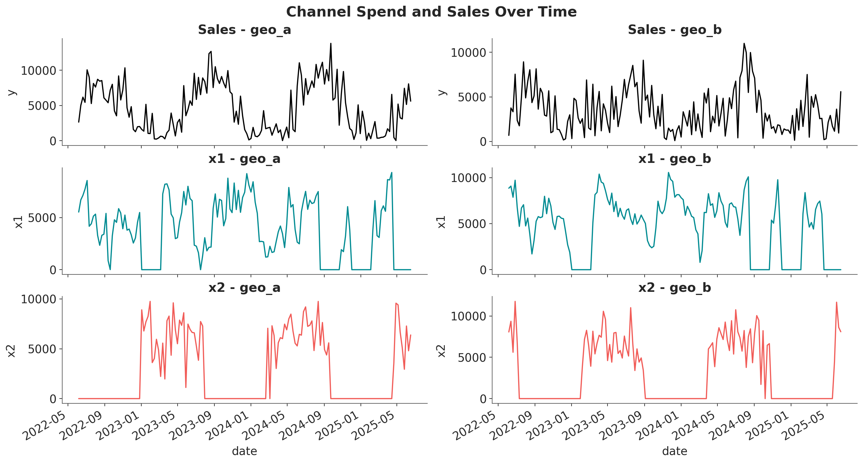
Let’s visualize the spend and sales data for each channel and geography.
fig, axes = plt.subplots(
    nrows=3,
    ncols=2,
    figsize=(15, 8),
    sharex=True,
    sharey=False,
    layout="constrained",
)

for i, geo in enumerate(["geo_a", "geo_b"]):
    geo_data = data_df.query("geo == @geo")

    for j, channel in enumerate(["x1", "x2"]):
        sns.lineplot(
            x=geo_data["date"],
            y=geo_data[channel],
            color=f"C{j}",
            ax=axes[j + 1, i],
        )
        axes[j + 1, i].set_title(f"{channel} - {geo}")

    sns.lineplot(
        x=geo_data["date"],
        y=geo_data["y"],
        color="black",
        ax=axes[0, i],
    )
    axes[0, i].set_title(f"Sales - {geo}")

fig.autofmt_xdate()
fig.suptitle("Channel Spend and Sales Over Time", fontsize=18, fontweight="bold");
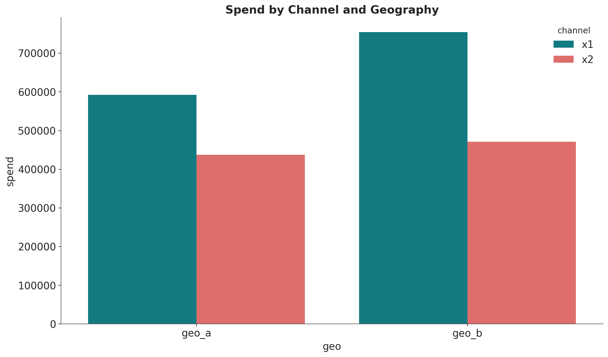
Let’s compute the spend share for each channel and geography.
fig, ax = plt.subplots()
(
    data_df.melt(
        id_vars=["geo", "date"],
        value_vars=["x1", "x2"],
        var_name="channel",
        value_name="spend",
    )
    .groupby(["geo", "channel"], as_index=False)
    .agg({"spend": "sum"})
    .pipe((sns.barplot, "data"), x="geo", y="spend", hue="channel", ax=ax)
)
ax.set_title("Spend by Channel and Geography");
Model Specification and Fitting#
We’ll fit a multi-dimensional MMM with:
Geometric Adstock: Models the carry-over effect of advertising
Logistic Saturation: Models diminishing returns as spend increases
For simplicity, we use a streamlined model configuration.
# Define adstock and saturation transformations
adstock = GeometricAdstock(
    priors={"alpha": Prior("Beta", alpha=2, beta=5, dims=("geo", "channel"))},
    l_max=8,
)

saturation = LogisticSaturation(
    priors={
        "beta": Prior("Gamma", mu=0.3, sigma=0.15, dims=("geo", "channel")),
        "lam": Prior("Gamma", mu=0.5, sigma=0.25, dims="channel"),
    }
)

# Model configuration
model_config = {
    "intercept": Prior("Gamma", mu=0.5, sigma=0.25, dims="geo"),
    "gamma_control": Prior("Normal", mu=0, sigma=0.5, dims="control"),
    "likelihood": Prior(
        "TruncatedNormal",
        lower=0,
        sigma=Prior("HalfNormal", sigma=1.5),
        dims=("date", "geo"),
    ),
}

# Create the MMM instance
mmm = MMM(
    date_column="date",
    target_column="y",
    channel_columns=["x1", "x2"],
    control_columns=["event_1", "event_2"],
    dims=("geo",),
    scaling={
        "channel": {"method": "max", "dims": ()},
        "target": {"method": "max", "dims": ()},
    },
    adstock=adstock,
    saturation=saturation,
    yearly_seasonality=2,
    model_config=model_config,
)
Now we fit the model.
# Prepare training data
x_train = data_df.drop(columns=["y"])
y_train = data_df["y"]

# Build and fit the model
mmm.build_model(X=x_train, y=y_train)

# Add original scale contribution variables (needed for original_scale=True in plots)
mmm.add_original_scale_contribution_variable(var=["channel_contribution", "y"])

sample_kwargs = {
    "draws": 1_500,
    "tune": 1_000,
    "chains": 4,
    "target_accept": 0.85,
    "nuts_sampler": "nutpie",
    "random_seed": rng,
}

# Fit the model
mmm.fit(
    X=x_train,
    y=y_train,
    **sample_kwargs,
)

# Sample posterior predictive
_ = mmm.sample_posterior_predictive(X=x_train, random_seed=rng)
/Users/will/github/pymc-eco/pymc-marketing/worktrees/pymc6-migrate/.venv/lib/python3.13/site-packages/pytensor/assumptions/diagonal.py:53: RuntimeWarning: invalid value encountered in multiply
  result = FactState.FALSE if np.any(data * ~eye_mask) else FactState.TRUE
NUTS[nutpie]: [y_sigma, gamma_fourier, gamma_control, adstock_alpha, saturation_lam, saturation_beta, intercept_contribution]
/Users/will/github/pymc-eco/pymc-marketing/worktrees/pymc6-migrate/.venv/lib/python3.13/site-packages/pytensor/assumptions/diagonal.py:53: RuntimeWarning: invalid value encountered in multiply
  result = FactState.FALSE if np.any(data * ~eye_mask) else FactState.TRUE
/Users/will/github/pymc-eco/pymc-marketing/worktrees/pymc6-migrate/.venv/lib/python3.13/site-packages/pytensor/assumptions/diagonal.py:53: RuntimeWarning: invalid value encountered in multiply
  result = FactState.FALSE if np.any(data * ~eye_mask) else FactState.TRUE
/Users/will/github/pymc-eco/pymc-marketing/worktrees/pymc6-migrate/.venv/lib/python3.13/site-packages/pytensor/link/numba/dispatch/basic.py:214: UserWarning: Numba will use object mode to run truncated_normal_rv{"(),(),(),()->()"}'s perform method. Set `pytensor.config.compiler_verbose = True` to see more details.
  warnings.warn(
Sampling: [y]
# Quick check of model diagnostics
print(f"Divergences: {mmm.idata.sample_stats.diverging.sum().values}")
Divergences: 0
We have no divergences!
We can continue by looking into the aggregated contribution posterior of each channel.
fig, ax = plt.subplots()
azp.plot_forest(
    xr.Dataset(
        {
            "channel_contribution": mmm.fit_result[
                "channel_contribution_original_scale"
            ].sum(dim="date")
        }
    ),
    combined=True,
);
---------------------------------------------------------------------------
NameError                                 Traceback (most recent call last)
Cell In[14], line 2
      1 fig, ax = plt.subplots()
----> 2 azp.plot_forest(xr.Dataset({"channel_contribution": mmm.fit_result["channel_contribution_original_scale"].sum(dim="date")}), combined=True, ax=ax);

NameError: name 'xr' is not defined
For Geo A, we see that the contribution of \(x_1\) and \(x_2\) are comparable whereas for Geo B, \(x_1\) has a much higher contribution than \(x_2\).
This is a great start, but we want to understand better these contributions and how they are related by the current spend levels.
Visualization 1: Direct/Marginal Contribution#
The saturation_scatterplot shows the direct relationship between spend and contribution at each time point. This visualization answers the question:
“Given a specific spend level, what is the direct contribution to sales?”
Each point in this plot represents a single observation (one time period), showing:
X-axis: Channel spend at that time point
Y-axis: Direct contribution to sales at that time point
fig, axes = mmm.plot.saturation_scatterplot(
    width_per_col=8,
    height_per_row=4,
    original_scale=True,
)
fig.suptitle(
    "Saturation Scatterplot: Direct Contribution vs. Spend",
    fontsize=18,
    fontweight="bold",
    y=1.01,
)
plt.tight_layout()
/var/folders/v2/k_5glrgn4mbbh_g0l7zd21b00000gn/T/ipykernel_61851/1864980976.py:1: FutureWarning: The legacy MMMPlotSuite will be removed in pymc-marketing 2.0.0. Set mmm.plot_suite = 'new' to opt in to the new namespace-based API. See the migration guide: https://www.pymc-marketing.io/en/stable/notebooks/mmm/mmm_plot_suite_migration_guide.html
  fig, axes = mmm.plot.saturation_scatterplot(
/var/folders/v2/k_5glrgn4mbbh_g0l7zd21b00000gn/T/ipykernel_61851/1864980976.py:12: UserWarning: The figure layout has changed to tight
  plt.tight_layout()
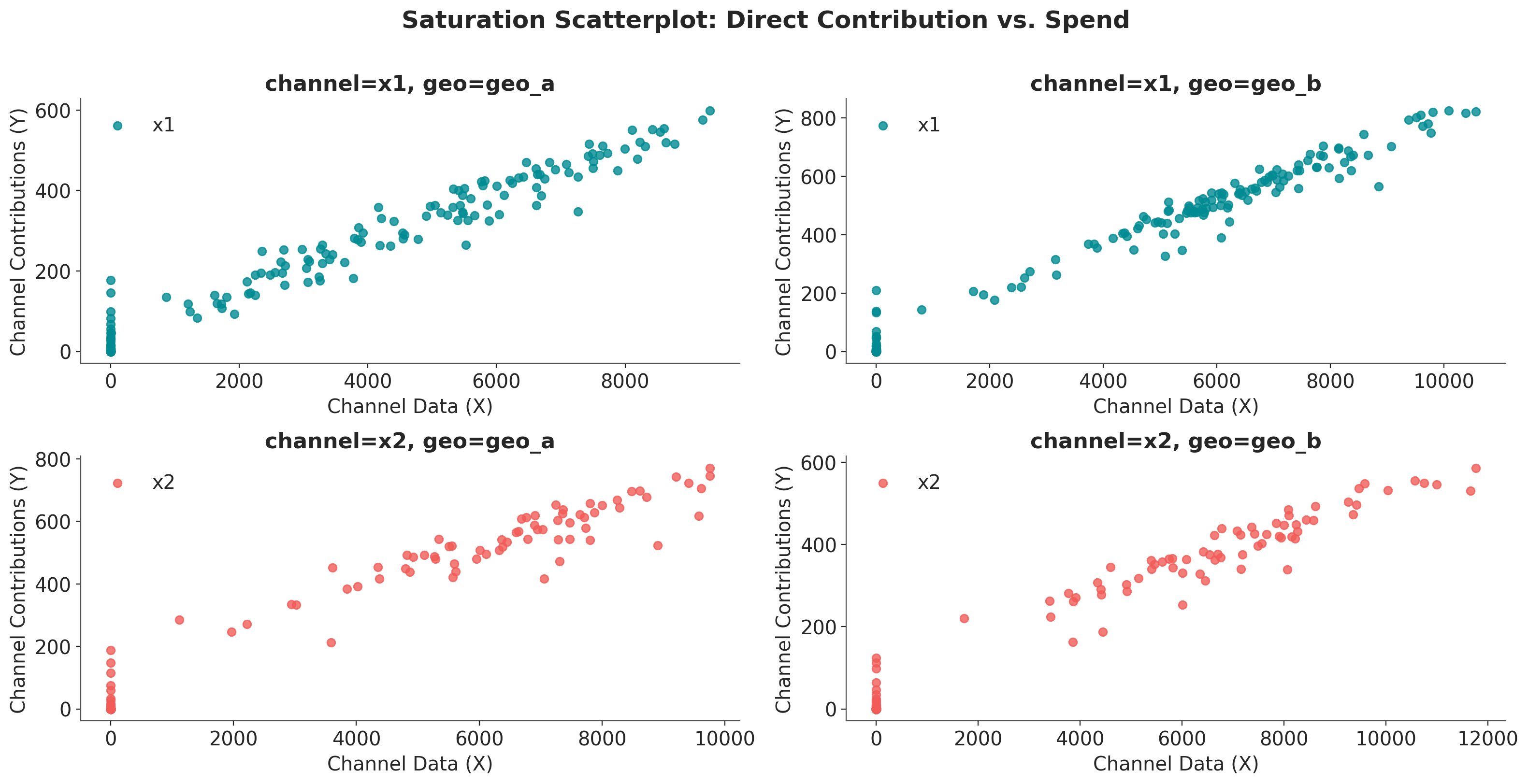
How to interpret this plot:
Shape of the curve: The fitted line shows how contribution increases with spend, with diminishing returns visible as the curve flattens at higher spend levels.
Scatter points: Each point represents a specific date’s spend-contribution pair.
Note
This plot shows the instantaneous/marginal relationship. It tells you “if I spend X on a given day, I expect Y contribution on that day.”
The reason you see non-zero contribution even at zero spend is because of the adstock effect.
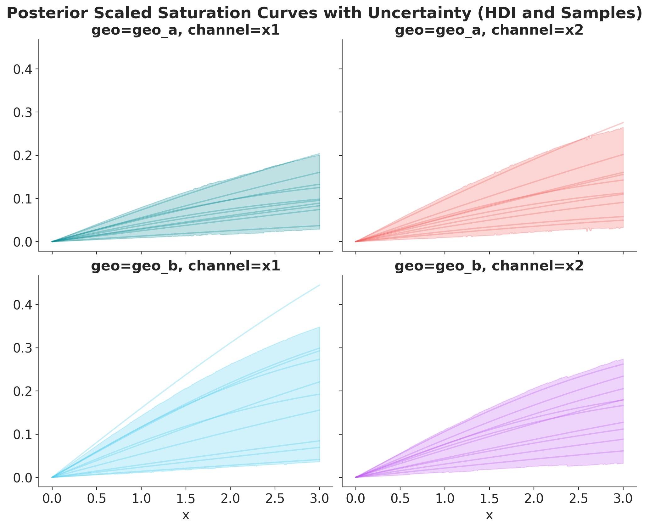
Tip
We can plot the posterior saturation curves for each channel and geography using the mmm.saturation.sample_curve method (please note you need to pass the whole posterior inference data!).
As we are internally scaling data data, these plots are in the scaled space. They are still useful to compare relative behavior across channels and geographies.
posterior_curve = mmm.saturation.sample_curve(
    mmm.idata["posterior"], num_points=500, max_value=3
)

# Plot the saturation curve with uncertainty (HDI and samples)
_, axes = plt.subplots(
    nrows=2,
    ncols=2,
    figsize=(10, 8),
    sharex=True,
    sharey=True,
    layout="constrained",
)
fig, axes = saturation.plot_curve(posterior_curve, axes=axes, random_seed=rng)
fig.suptitle(
    "Posterior Scaled Saturation Curves with Uncertainty (HDI and Samples)",
    fontsize=18,
    fontweight="bold",
    y=1.03,
);
Sampling: []
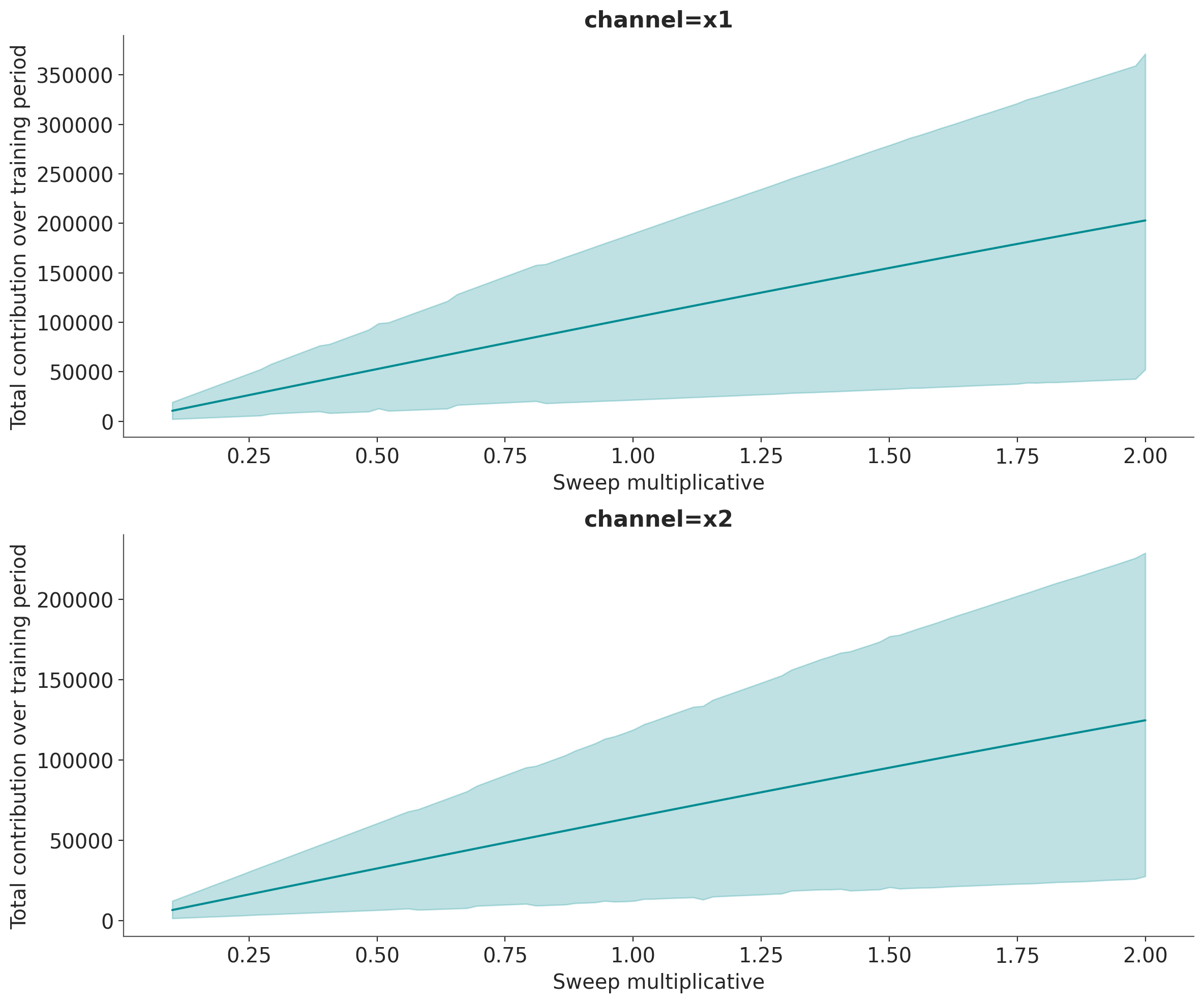
Visualization 2: Total Contribution over Spend Share#
The sensitivity_analysis shows how total contribution (summed over all time periods) changes as you scale overall spend. This visualization answers the question:
“If I increase/decrease my total budget by X%, what is the total impact on sales?”
This is a counterfactual analysis: we ask “what would have happened if we had spent more or less?”
# Here we set scenarios to sweep over
# a 10% to 200% of the historical spend.
sweeps = np.linspace(0.1, 2.0, 100)
mmm.sensitivity.run_sweep(
    sweep_values=sweeps,
    var_input="channel_data",
    var_names="channel_contribution_original_scale",
    extend_idata=True,  # it could be false and you save the object
)
Let’s plot the results:
fig, axes = mmm.plot.sensitivity_analysis(
    xlabel="Sweep multiplicative",
    ylabel="Total contribution over training period",
    hue_dim="channel",
    subplot_kwargs={"nrows": 2, "figsize": (12, 10)},
)

for ax in axes.flat:
    ax.axvline(1.0, color="black", linestyle="--", linewidth=1)
/Users/will/github/pymc-eco/pymc-marketing/worktrees/pymc6-migrate/pymc_marketing/mmm/plot.py:3483: UserWarning: The figure layout has changed to tight
  fig.tight_layout()
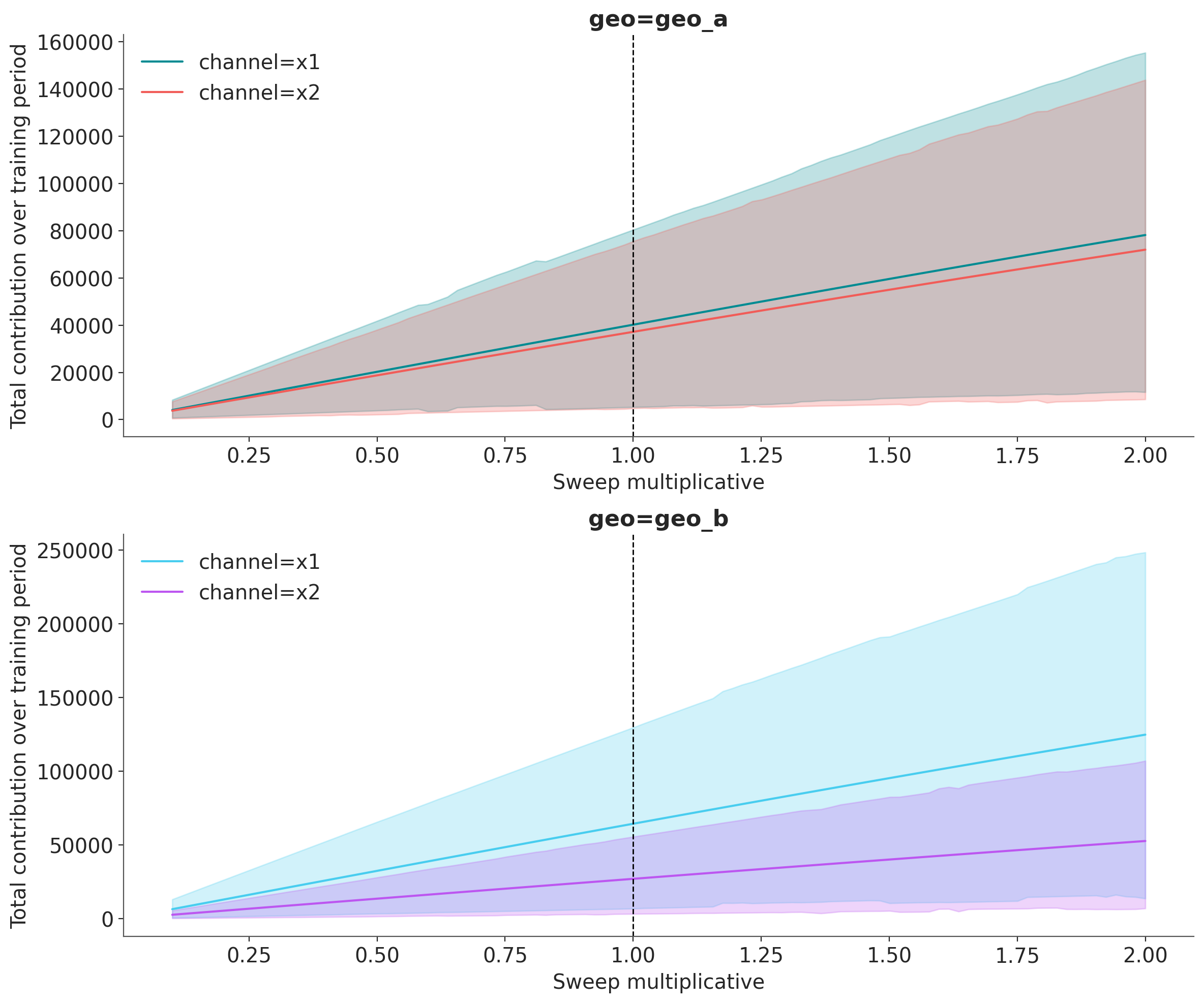
How to interpret this plot:
X-axis (sweep multiplicative): The spend multiplier. A value of 1.0 represents the actual historical spend, 0.5 means half the spend, and 2.0 means double the spend.
Y-axis (Total Contribution): The sum of contributions across all time periods in the dataset.
Vertical line at sweep=1: This marks the current/historical spend level.
HDI bands: Show the uncertainty in total contribution at each spend level.
Curve shape:
Steep slope at low sweep → High marginal returns (you’re not yet saturated)
Flattening slope at high sweep → Diminishing returns (approaching saturation)
Important
This plot shows the global/total relationship. It tells you “across the entire time period, if I had scaled all my spend by factor “sweep”, my total contribution would be Y.”
Observe, that these results are consistent with the initial total copntribution analysis: For Geo A, \(x_1\) and \(x_2\) have similar contributions, but for Geo B, \(x_1\) has a much higher contribution than \(x_2\) (at the current spend levels).
Advanced Usage#
The plot.sensitivity_analysis method supports several advanced options for customization.
Using Absolute X-Axis#
Instead of showing the sweep multiplier on the x-axis, you can display absolute spend values using x_sweep_axis="absolute". This multiplies the sweep values by the channel_scale for each channel, so each line shows its actual spend range.
Note: When using x_sweep_axis="absolute":
Each channel will have its own X-axis range based on its scale factor
For example, if channel A has scale 500K and channel B has scale 2M, at sweep=2x:
Channel A shows values up to 1M (500K x 2)
Channel B shows values up to 4M (2M x 2)
This is useful for seeing actual spend values rather than relative multipliers
Requires
hue_dimto be set (typically “channel”)
Let’s first examine the sensitivity analysis data structure:
fig, axes = mmm.plot.sensitivity_analysis(
    xlabel="Sweep Multiplicative (Absolute X axis)",
    ylabel="Total contribution over training period",
    hue_dim="channel",
    x_sweep_axis="absolute",
    subplot_kwargs={"nrows": 2, "figsize": (12, 10)},
)
/Users/will/github/pymc-eco/pymc-marketing/worktrees/pymc6-migrate/pymc_marketing/mmm/plot.py:3483: UserWarning: The figure layout has changed to tight
  fig.tight_layout()
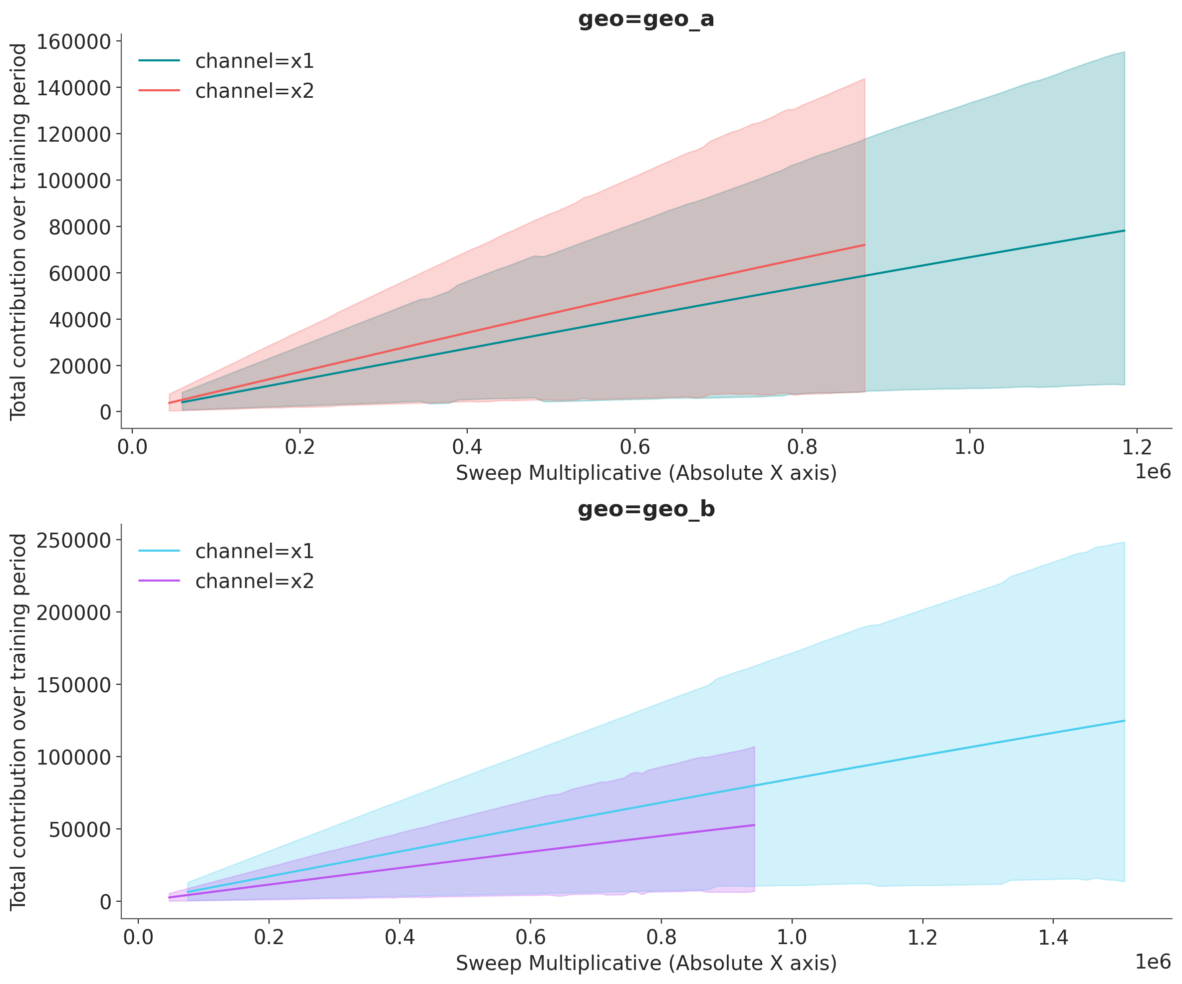
With x_sweep_axis="absolute":
The x-axis shows actual spend values (sweep multiplier x total spend over the training period)
Each channel has its own x-axis range based on its scale factor
This view is more intuitive for budget discussions (“If we spend X total, we get Y contribution”)
Note: Lines may end at different x-values since channels have different scales
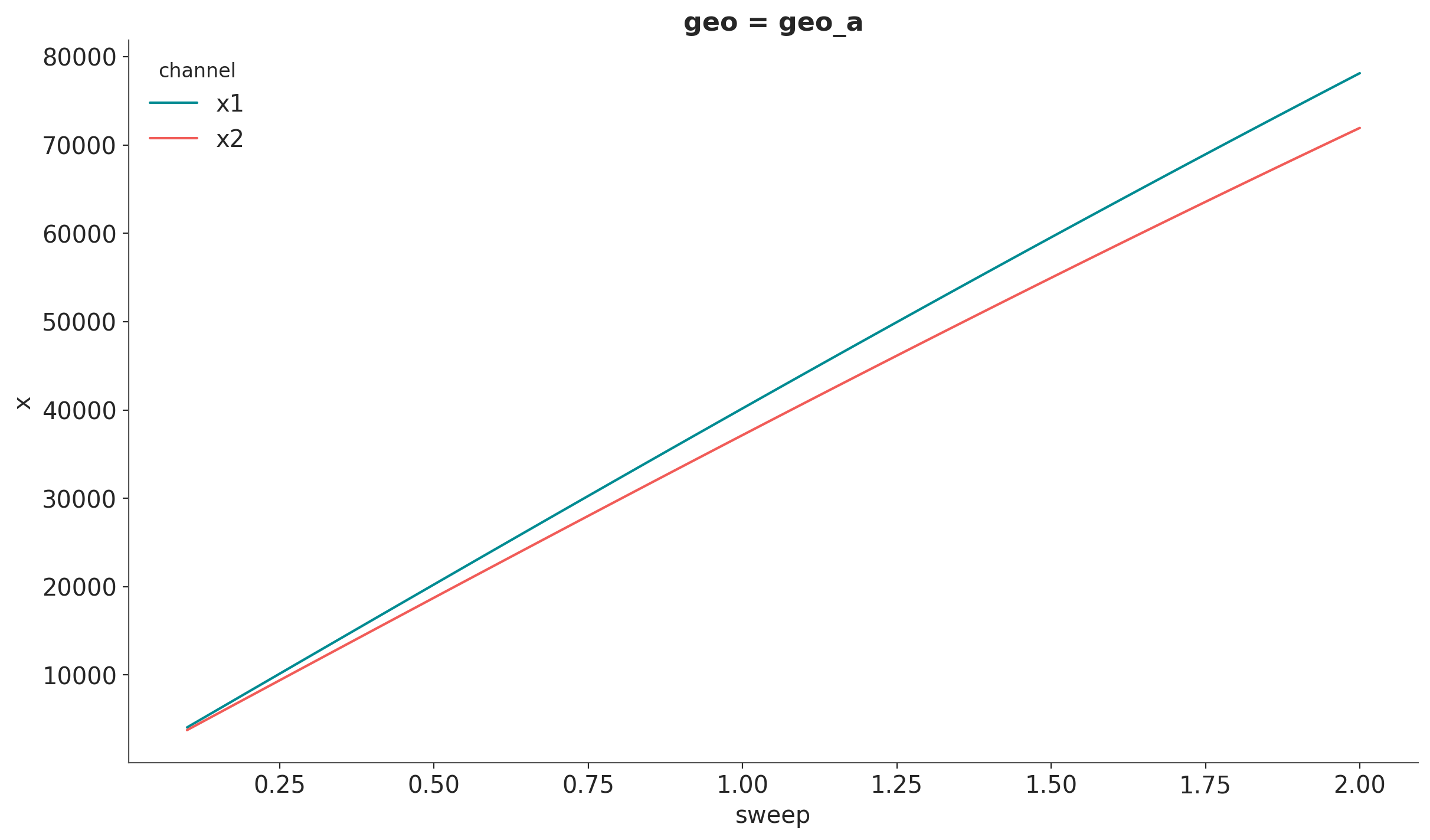
Filtering by Geography#
We can use xarray’s API to filter by geography.
channels_geo_a = mmm.idata.sensitivity_analysis.sel(geo="geo_a")

# Plot the mean line
channels_geo_a.mean(dim=["sample"]).x.plot(hue="channel")

# For HDI, iterate over channels and pass DataArrays
for index, channel in enumerate(channels_geo_a.coords["channel"].values):
    hdi = az.hdi(channels_geo_a["x"].sel(channel=channel), prob=0.94, dim="sample")
    plt.fill_between(
        channels_geo_a.coords["sweep"],
        hdi.sel(ci_bound="lower"),
        hdi.sel(ci_bound="upper"),
        color=f"C{index}",
    )
---------------------------------------------------------------------------
ValueError                                Traceback (most recent call last)
Cell In[20], line 8
      4 channels_geo_a.mean(dim=["sample"]).x.plot(hue="channel")
      5
      6 # For HDI, iterate over channels and pass DataArrays
      7 for index, channel in enumerate(channels_geo_a.coords["channel"].values):
----> 8     hdi = az.hdi(channels_geo_a["x"].sel(channel=channel), prob=0.94)
      9     plt.fill_between(channels_geo_a.coords["sweep"], hdi.sel(ci_bound="lower"), hdi.sel(ci_bound="upper"), color=f"C{index}")

File ~/github/pymc-eco/pymc-marketing/worktrees/pymc6-migrate/.venv/lib/python3.13/site-packages/arviz_stats/visualization.py:103, in hdi(data, prob, dim, group, var_names, filter_vars, coords, method, circular, max_modes, skipna, **kwargs)
     21 r"""Compute the highest density interval (HDI) given a probability.
     22
     23 The HDI is the shortest interval that contains the specified probability mass.
   (...)    100     In [1]: azs.hdi(dt, dim=["chain","draw", "school"])
    101 """
    102 prob = validate_ci_prob(prob)
--> 103 return _apply_multi_input_function(
    104     "hdi",
    105     data,
    106     dim,
    107     "dim",
    108     group=group,
    109     var_names=var_names,
    110     filter_vars=filter_vars,
    111     coords=coords,
    112     prob=prob,
    113     method=method,
    114     circular=circular,
    115     max_modes=max_modes,
    116     skipna=skipna,
    117     **kwargs,
    118 )

File ~/github/pymc-eco/pymc-marketing/worktrees/pymc6-migrate/.venv/lib/python3.13/site-packages/arviz_stats/utils.py:344, in _apply_multi_input_function(name, data, dims, dims_arg, group, var_names, filter_vars, coords, **kwargs)
    342         data = data.sel(coords)
    343     _warn_non_unique_coords(data, dims)
--> 344     return getattr(data.azstats, name)(**all_kwargs)
    346 if isinstance(data, xr.DataTree):
    347     data = data.azstats.filter_vars(
    348         group=group, var_names=var_names, filter_vars=filter_vars
    349     ).datatree

File ~/github/pymc-eco/pymc-marketing/worktrees/pymc6-migrate/.venv/lib/python3.13/site-packages/arviz_stats/accessors.py:92, in _BaseAccessor.hdi(self, prob, dim, **kwargs)
     90 """Compute hdi on all variables in the dataset."""
     91 kwargs["prob"] = prob
---> 92 return self._apply("hdi", dim=dim, **kwargs)

File ~/github/pymc-eco/pymc-marketing/worktrees/pymc6-migrate/.venv/lib/python3.13/site-packages/arviz_stats/accessors.py:394, in AzStatsDaAccessor._apply(self, func, **kwargs)
    392 if isinstance(func, str):
    393     func = get_function(func)
--> 394 return func(self._obj, **kwargs)

File ~/github/pymc-eco/pymc-marketing/worktrees/pymc6-migrate/.venv/lib/python3.13/site-packages/arviz_stats/base/dataarray.py:55, in BaseDataArray.hdi(self, da, prob, dim, method, **kwargs)
     51 mode_dim = "mode" if da.name is None else f"{da.name}_mode"
     52 hdi_coord = DataArray(
     53     ["lower", "upper"], dims=["ci_bound"], attrs={"ci_kind": "hdi", "ci_prob": prob}
     54 )
---> 55 return apply_ufunc(
     56     self.array_class.hdi,
     57     da,
     58     prob,
     59     input_core_dims=[dims, []],
     60     output_core_dims=[
     61         [mode_dim, "ci_bound"] if method.startswith("multimodal") else ["ci_bound"]
     62     ],
     63     kwargs={
     64         "axis": np.arange(-len(dims), 0, 1),
     65         "method": method,
     66         **kwargs,
     67     },
     68 ).assign_coords({"ci_bound": hdi_coord})

File ~/github/pymc-eco/pymc-marketing/worktrees/pymc6-migrate/.venv/lib/python3.13/site-packages/xarray/computation/apply_ufunc.py:1267, in apply_ufunc(func, input_core_dims, output_core_dims, exclude_dims, vectorize, join, dataset_join, dataset_fill_value, keep_attrs, kwargs, dask, output_dtypes, output_sizes, meta, dask_gufunc_kwargs, on_missing_core_dim, *args)
   1265 # feed DataArray apply_variable_ufunc through apply_dataarray_vfunc
   1266 elif any(isinstance(a, DataArray) for a in args):
-> 1267     return apply_dataarray_vfunc(
   1268         variables_vfunc,
   1269         *args,
   1270         signature=signature,
   1271         join=join,
   1272         exclude_dims=exclude_dims,
   1273         keep_attrs=keep_attrs,
   1274     )
   1275 # feed Variables directly through apply_variable_ufunc
   1276 elif any(isinstance(a, Variable) for a in args):

File ~/github/pymc-eco/pymc-marketing/worktrees/pymc6-migrate/.venv/lib/python3.13/site-packages/xarray/computation/apply_ufunc.py:312, in apply_dataarray_vfunc(func, signature, join, exclude_dims, keep_attrs, *args)
    307 result_coords, result_indexes = build_output_coords_and_indexes(
    308     args, signature, exclude_dims, combine_attrs=keep_attrs
    309 )
    311 data_vars = [getattr(a, "variable", a) for a in args]
--> 312 result_var = func(*data_vars)
    314 out: tuple[DataArray, ...] | DataArray
    315 if signature.num_outputs > 1:

File ~/github/pymc-eco/pymc-marketing/worktrees/pymc6-migrate/.venv/lib/python3.13/site-packages/xarray/computation/apply_ufunc.py:732, in apply_variable_ufunc(func, signature, exclude_dims, dask, output_dtypes, vectorize, keep_attrs, dask_gufunc_kwargs, *args)
    725 broadcast_dims = tuple(
    726     dim for dim in dim_sizes if dim not in signature.all_core_dims
    727 )
    728 output_dims = [broadcast_dims + out for out in signature.output_core_dims]
    730 input_data = [
    731     (
--> 732         broadcast_compat_data(arg, broadcast_dims, core_dims)
    733         if isinstance(arg, Variable)
    734         else arg
    735     )
    736     for arg, core_dims in zip(args, signature.input_core_dims, strict=True)
    737 ]
    739 if any(is_chunked_array(array) for array in input_data):
    740     if dask == "forbidden":

File ~/github/pymc-eco/pymc-marketing/worktrees/pymc6-migrate/.venv/lib/python3.13/site-packages/xarray/computation/apply_ufunc.py:677, in broadcast_compat_data(variable, broadcast_dims, core_dims)
    675 reordered_dims = old_broadcast_dims + core_dims
    676 if reordered_dims != old_dims:
--> 677     order = tuple(old_dims.index(d) for d in reordered_dims)
    678     data = duck_array_ops.transpose(data, order)
    680 if new_dims != reordered_dims:

File ~/github/pymc-eco/pymc-marketing/worktrees/pymc6-migrate/.venv/lib/python3.13/site-packages/xarray/computation/apply_ufunc.py:677, in <genexpr>(.0)
    675 reordered_dims = old_broadcast_dims + core_dims
    676 if reordered_dims != old_dims:
--> 677     order = tuple(old_dims.index(d) for d in reordered_dims)
    678     data = duck_array_ops.transpose(data, order)
    680 if new_dims != reordered_dims:

ValueError: tuple.index(x): x not in tuple
Aggregating Across Geographies#
Use the aggregation parameter to combine results across dimensions. This is useful when you want to see the total impact across all markets:
fig, axes = mmm.plot.sensitivity_analysis(
    xlabel="Sweep multiplicative",
    ylabel="Total contribution over training period",
    aggregation={"sum": ("geo",)},
    subplot_kwargs={"figsize": (12, 10), "nrows": 2},
)
/Users/will/github/pymc-eco/pymc-marketing/worktrees/pymc6-migrate/pymc_marketing/mmm/plot.py:3483: UserWarning: The figure layout has changed to tight
  fig.tight_layout()
Supported aggregation operations:
"sum": Sum contributions across the specified dimensions"mean": Average contributions across the specified dimensions"median": Median contributions across the specified dimensions
Summary#
In this tutorial, we explored two complementary ways to visualize media saturation in Marketing Mix Models:
saturation_scatterplot: Shows the direct/marginal relationship between spend and contribution at each time point. Best for understanding the shape of saturation and validating model behavior.sensitivity_analysis: Shows how total contribution changes as you scale overall spend. Best for budget planning, what-if analysis, and making allocation decisions.
Understanding the difference between these visualizations is crucial for correctly interpreting your MMM results and making informed marketing decisions.
%load_ext watermark
%watermark -n -u -v -iv -w -p pymc_marketing
Last updated: Tue, 09 Jun 2026

Python implementation: CPython
Python version       : 3.13.2
IPython version      : 9.14.0

pymc_marketing: 1.0.0.dev0

arviz         : 1.1.0
arviz_plots   : 1.1.0
matplotlib    : 3.10.9
numpy         : 2.4.6
pandas        : 2.3.3
polars        : 1.41.2
preliz        : 0.25.0
pymc          : 6.0.1
pymc_extras   : 0.11.1.dev1+gd3254d131
pymc_marketing: 1.0.0.dev0
seaborn       : 0.13.2
xarray        : 2026.4.0

Watermark: 2.6.0